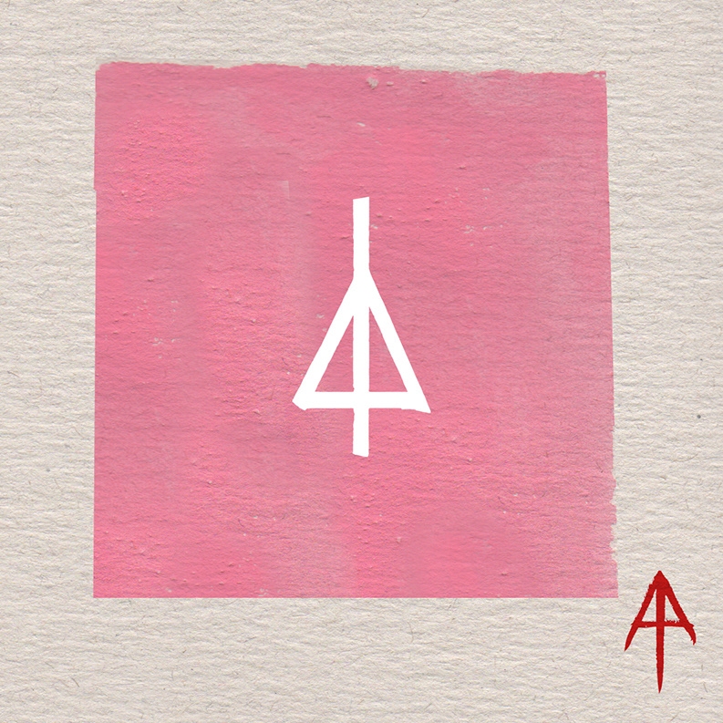
Working with a previous client for original traditional art for their brand, I was also later tasked with redesigning their logo that is currently in use for a more organic look to fit the hand drawn aspect of the series of work created previously. After a few options were drawn out, we settled on the final one that was used to promote the brand and concert.
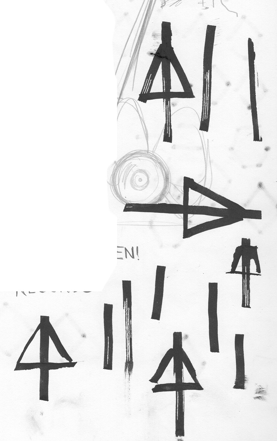
Here were the initial sketches done with a parallel ink pen to still get a sense of straight design.
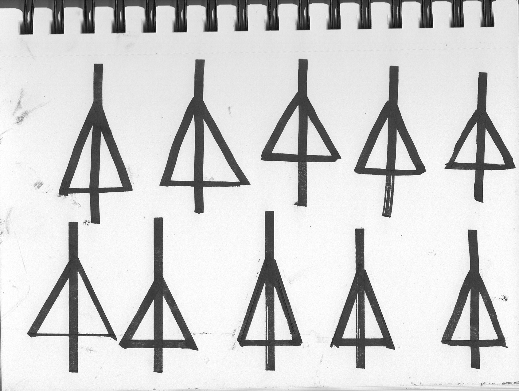
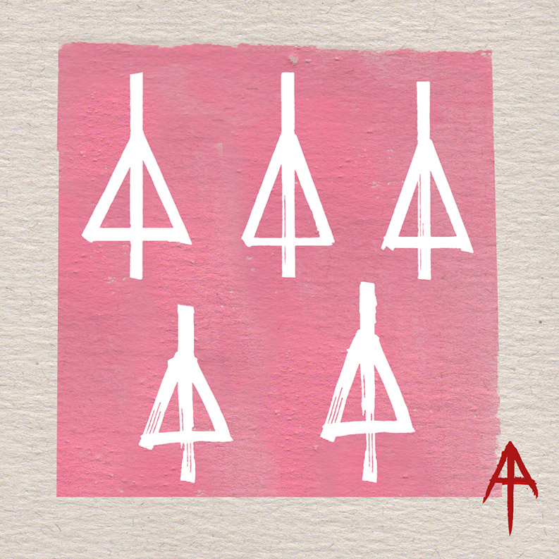
We then broke it down to a few that had the right aesthetic.
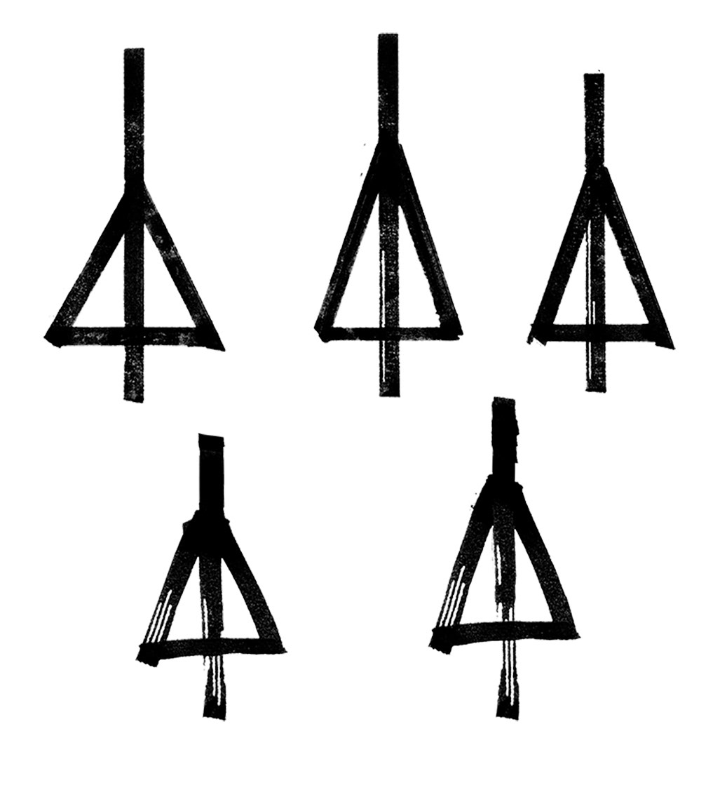
Eventually composing them in a way that would be closer to their final looks.
And then ultimately landed on this one that was the closest to their original while still retaining the hand drawn organic aspect to it. Which became the final result.